Asgard Lodge Nursing Home
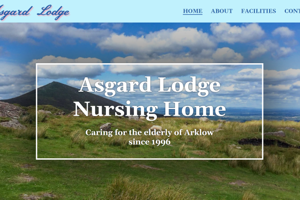
The first website I developed has already begun to show results for this business!
The owners of Asgard Lodge asked me to revamp their website to celebrate 25 years of caring for the elderly. They wanted their online presense to be reflective of their dedication to healthcare and providing a wonderful place to live.
Working together, we envisioned the overall look and feel of the site: a soft colour palette to provide a feeling of warmth and comfort; a seaside theme to represent the family's sailing heritage; elegant yet sizable fonts to ensure ease of reading for viewers of all ages; detailed descriptions and vibrant photos to show off the fantastic accommodations they provide.
Under the hood, each page is fully search optimized with terms specific to its content. Focus markers, image alt texts, and structural layout are all in line with current Web Content Accessibility Guidelines. Custom thumbnails, titles, and text are generated whenever a user shares the site on social media. A prepositioned Google map is embedded into the contact page for simplified directions. And finally, the site is fully responsive, offering different navigation options at different screen sizes.
PunkIPA Beer Selector
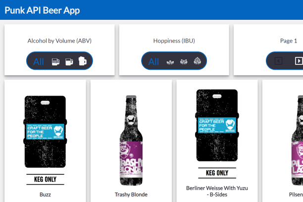
Using an API to choose your IPA!
This is a project I completed while learning JavaScript and API data manipulation. It wasn't my first experience using an API, but it introduced me to dynamic application of fetched data and the endless possibilities it offers.
It was a great lesson for getting comfortable with switch statements, event listeners, forEach loops, HTML element creation, and pagination. I also happen to truly enjoy a nice, hoppy beer, so that was an added bonus.
PAC-LAD
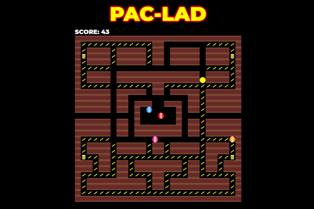
Everyone's favourite retro arcade game with a fun twist...
This was the very first JavaScript application that I ever created. It is a tutorial by Anya Kubow that I followed along with, but then changed the look and feel to make it more my own.
It was quite an intimidating experience, as there is so much that goes into it, and I was very new to JS at the time. Other than a few introductory courses, this was my first time using layouts, advanced array manipulation, for loops with conditionals, class toggling, key codes, switch statements with multiple parameters, event listeners, classes and constructors, setInterval functions, '&&' and '||' operators, and innerHTML.
The game runs just like the original PAC-MAN, only you play a drunk in an Irish pub. Your goal is to fill up on bacon fries and pints while avoiding the skangers in tracksuits looking to bum smokes off of you. Drink your pints, eat your snacks, and keep your smokes to yourself for the win!
2D Language in the Third Dimension
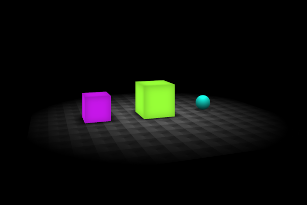
CSS is by far my favourite language. I truly love design.
From the moment I created my first div and stylised its background colour, I knew CSS would click with me. The design elements of web development are what first drew me into this new obsession. Being able to create beautiful pages, layouts, menus, the works.
But the more I explored and researched and practiced, the more I began to find absolutely mind boggling things people have been able to create by stretching the limits of CSS' capabilities. After watching roughly a thousand hours of videos, I decided to try some of my own!
Google Keep Clone
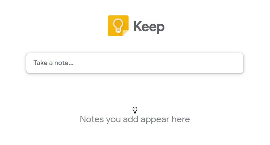
A program that I use more than anyone I know!
This was the final projct from my most recent JS bootcamp. While it may look quite simple, a surprising amount of code goes into it! It was a breakthrough for me as well, as it really helped me truly understand class constructors and object oriented programming for the first time.
This project was especially close to the vest for me, as I use Keep to manage my large scale Dungeons & Dragon campaign. On the official Google application, I have hundreds on notes filed under tens of labels, broken down into each of our bi-weekly sessions. Getting the chance to see what's under the hood was really interesting, and it's always a pleasure to see just how much code goes into seemingly simple mechanics.
Blues Brothers Business
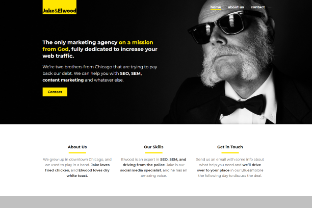
A fun tutorial by the man himself, Kevin "The King of CSS" Powell.
This project was part of Scrimba's Responsive Web Design bootcamp. It introduced me to modifier classes, pseudo elements, and reusable code.
It was the first chance I got to work with a multi-page layout, and it was great to learn how to reuse code and keep things DRY (Don't Repeat Yourself). Kevin is my favourite teacher, and the person who got me into CSS and introduced me to Scrimba. He's probably the single largest influence on my coding journey thus far, and we've never even met.
We began by setting up our clearouts and presets. Then it was time to create classes that could be reused in a variety of places to not only save time and effort, but also to ensure consistency across all the site pages. It was a game-changer when we built the index page and then used everything we'd coded to quickly and easily generate the about and contact pages. You'll notice that my personal website does exactly that!
